
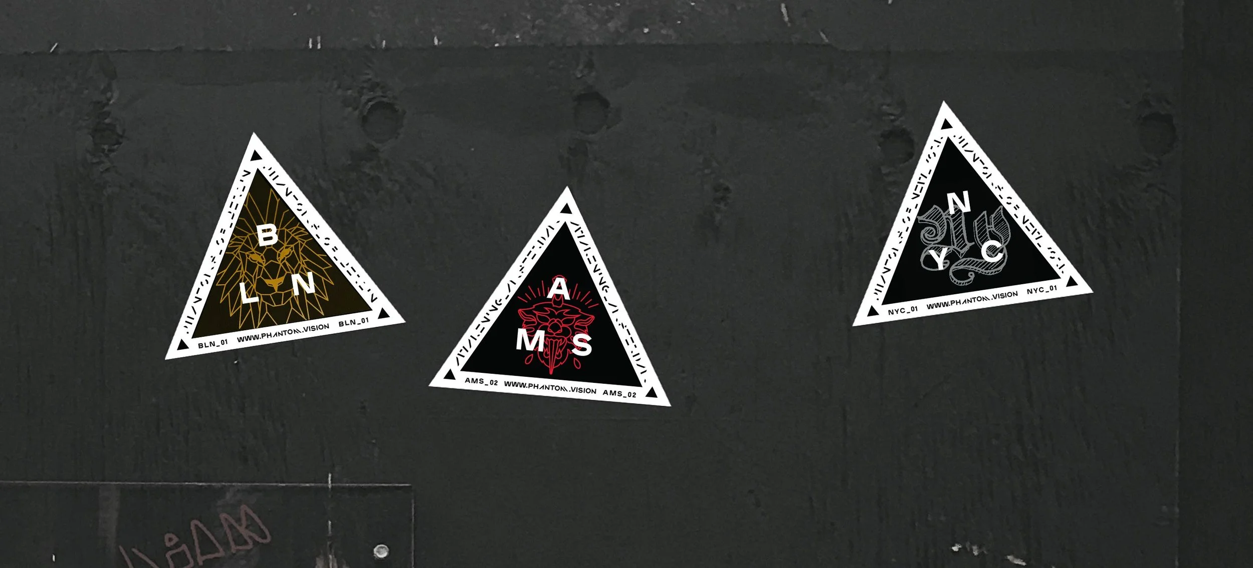
-My latest work
Work from 2013 to now
Scroll to continue
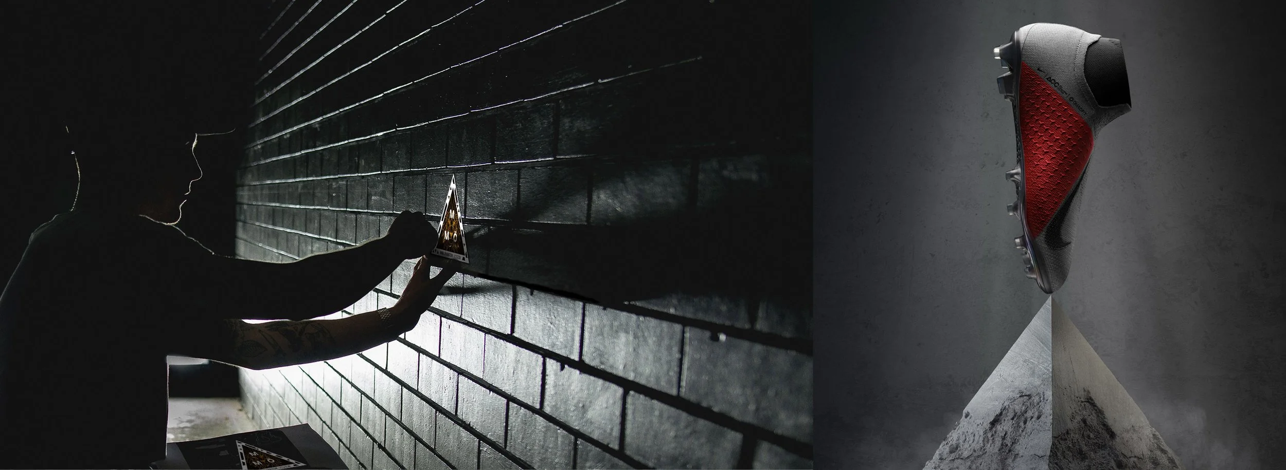
Nike
campaign
Nike's next-generation football shoe, The Phantom, debuted during the 2018 World Cup in Russia. I helped Nike engage audiences using an augmented reality web app during its global launch campaign. This together with 50 concepts to explore the right fit of technology, branding, marketing, and user experience.
visual & motion design
art direction
campaign design
qr


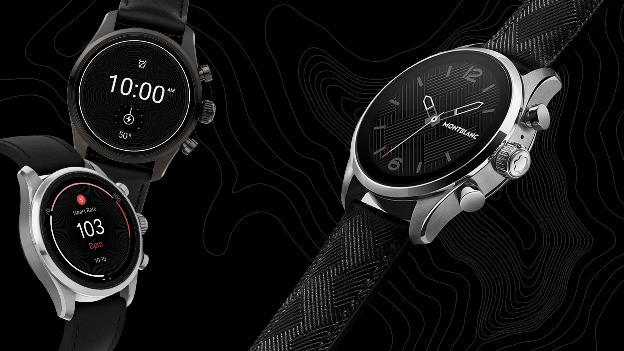
Montblanc
brand alignment
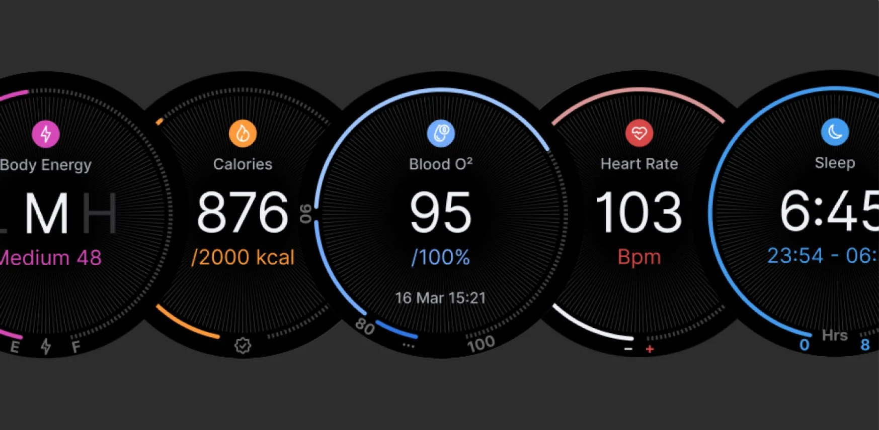
Montblanc approached me to completely redesign their smartwatch and companion app, as the previous experience didn’t reflect the quality of their brand. Working closely with developers and project stakeholders, I transformed the UX together with the look and feel to deliver a more modern, premium experience — one that aligns with Montblanc’s identity as a high-end luxury brand.
product design
app design
visual & motion style
guidelines

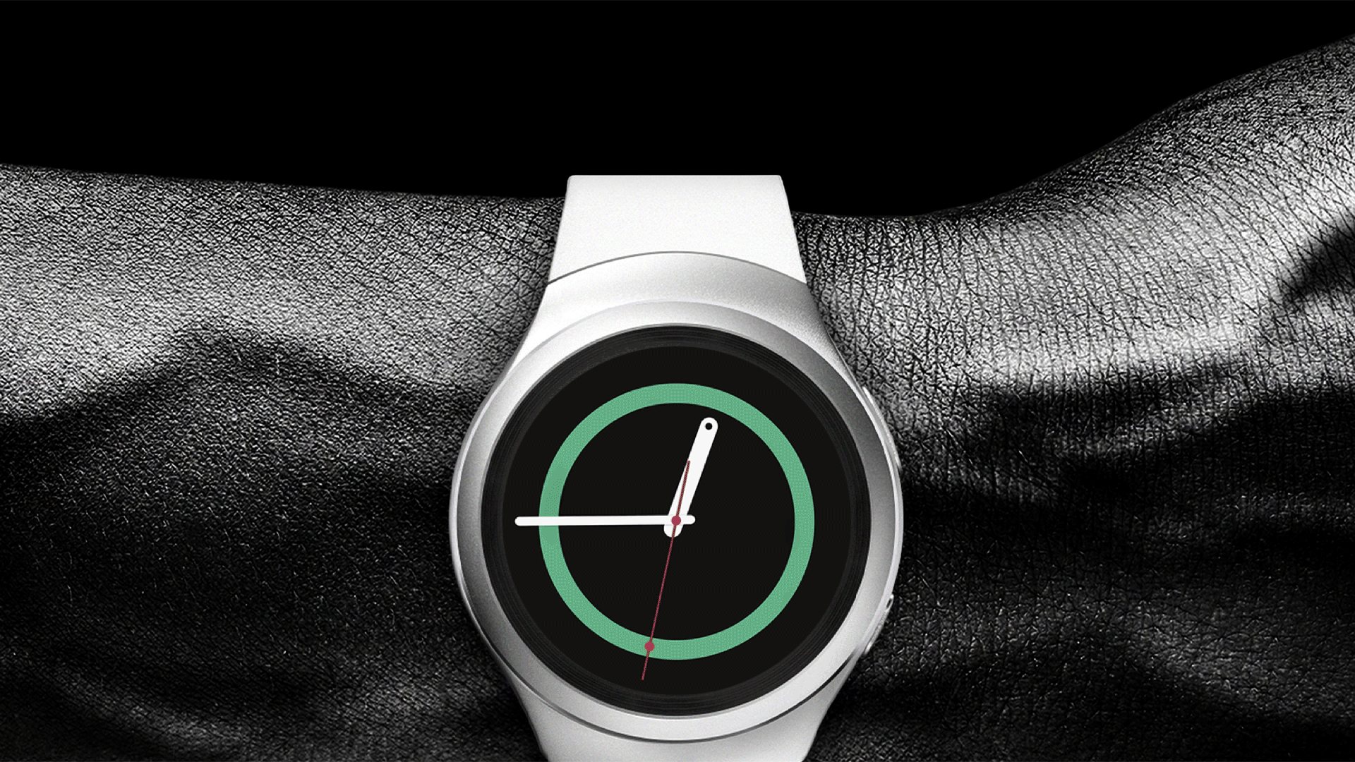
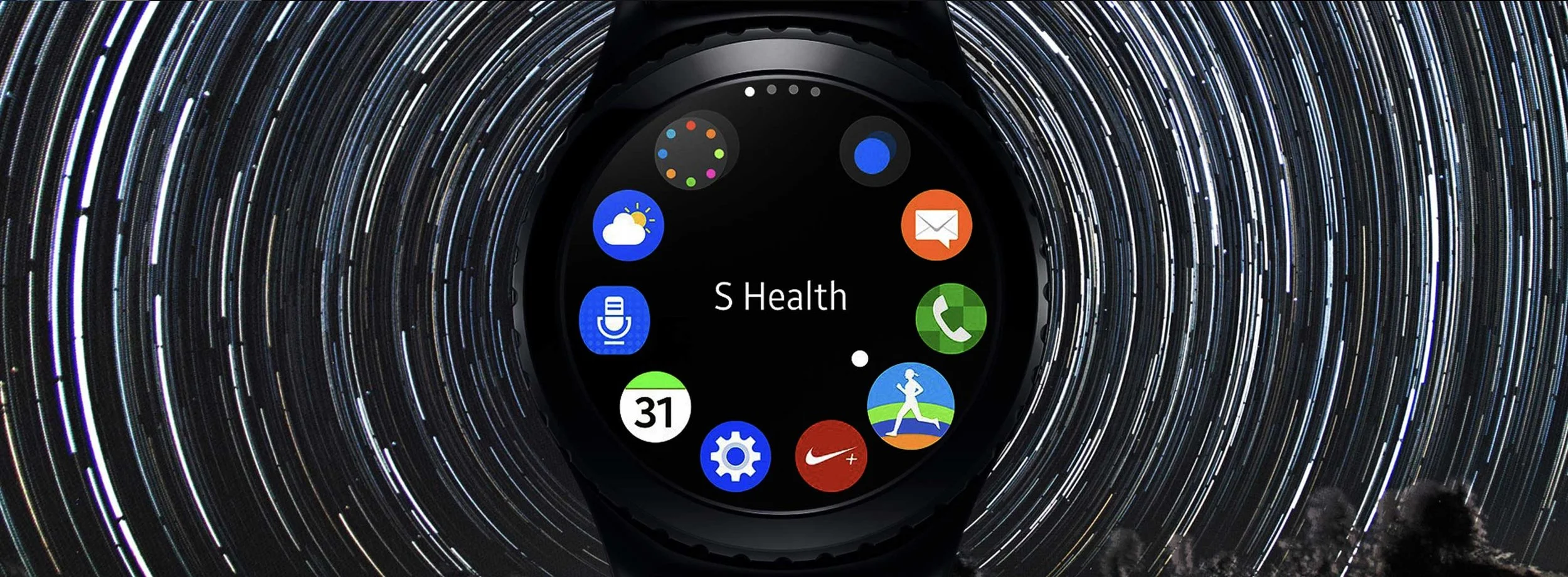
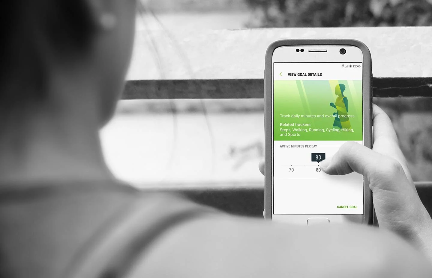
Samsung
Gear S2
I art directed and created style & motion language for Samsung’s new smartwatch framework, targeting their new line of watches running on Tizen. First out was the Gear S2. With a brand new circular display and a rotary bezel for interaction, new challenges were presented and the traditional rectangular UI designs had to be adapted and re-invented for a true circular design. It needed style and had to be more than a fitness tracker.
product design
app design
visual & motion style
guidelines
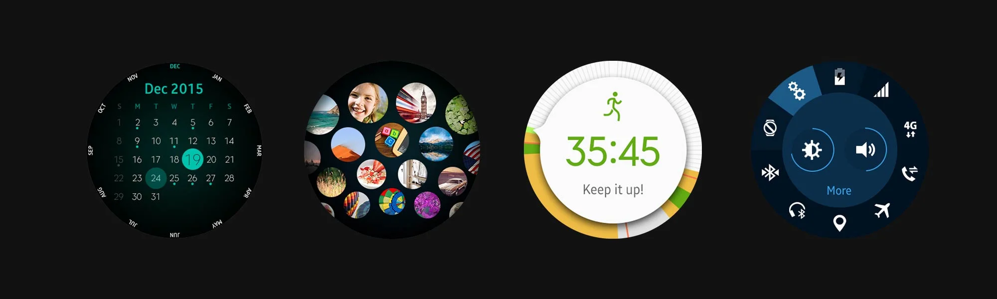
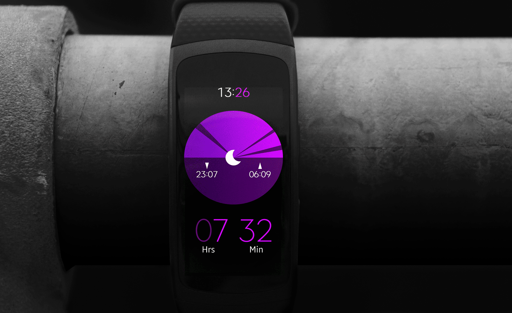
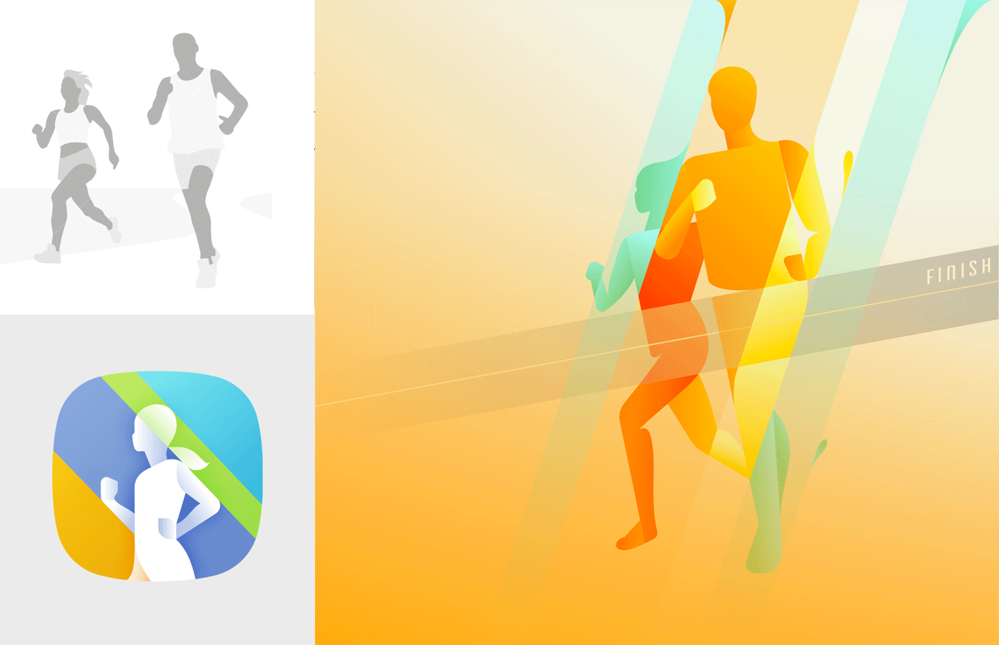
Samsung
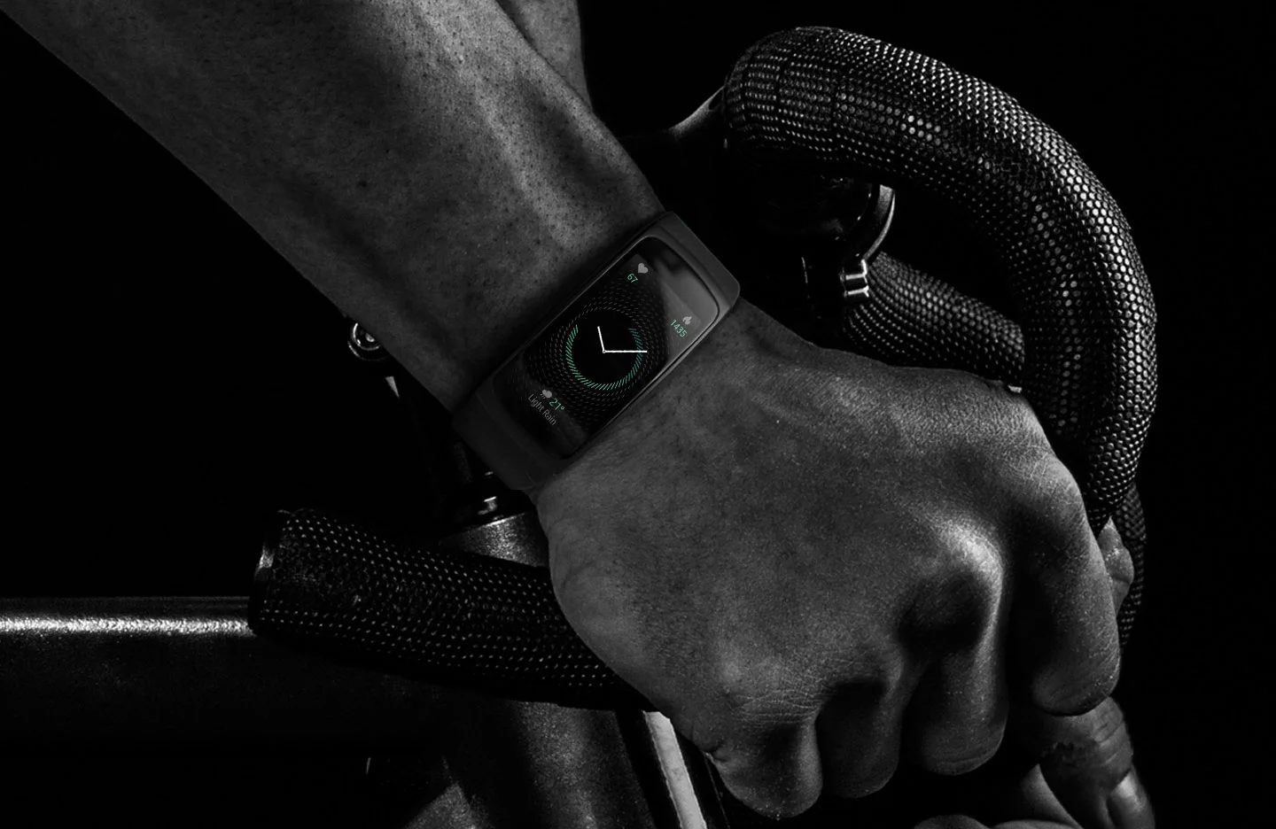
Gear Fit2
I also helped Samsung with the Gear S2’s successor Gear Fit2, creating a fitness tracker using visual style as a core differentiator. Still a smartwatch running on Tizen, but with a different form factor and different use case. The design therefore became dark-themed, highlighted by vibrancy. It is intended to blend with the hardware making the small screen appear larger, and enable information visualisation that is highly glanceable while on the run.
product design
visual & motion style
guidelines

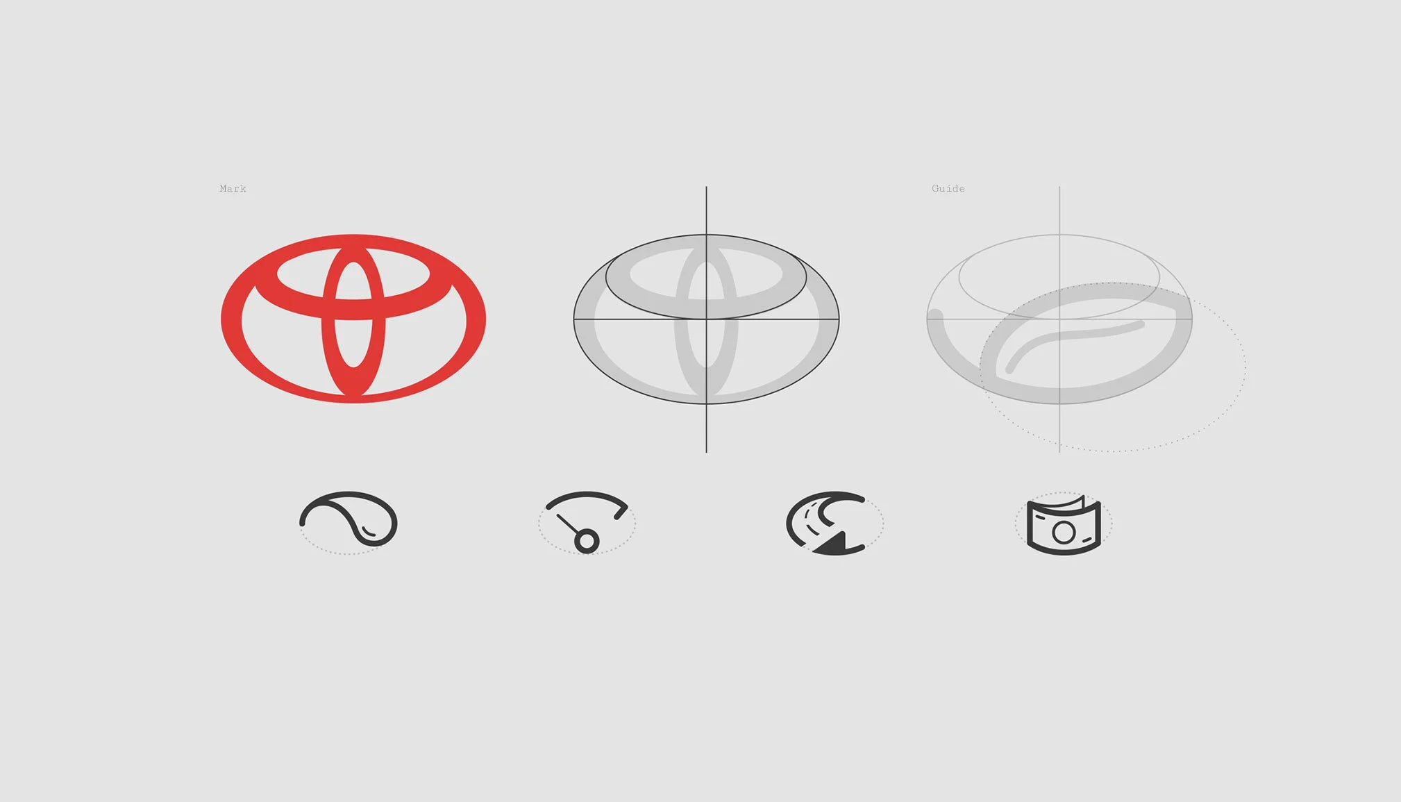
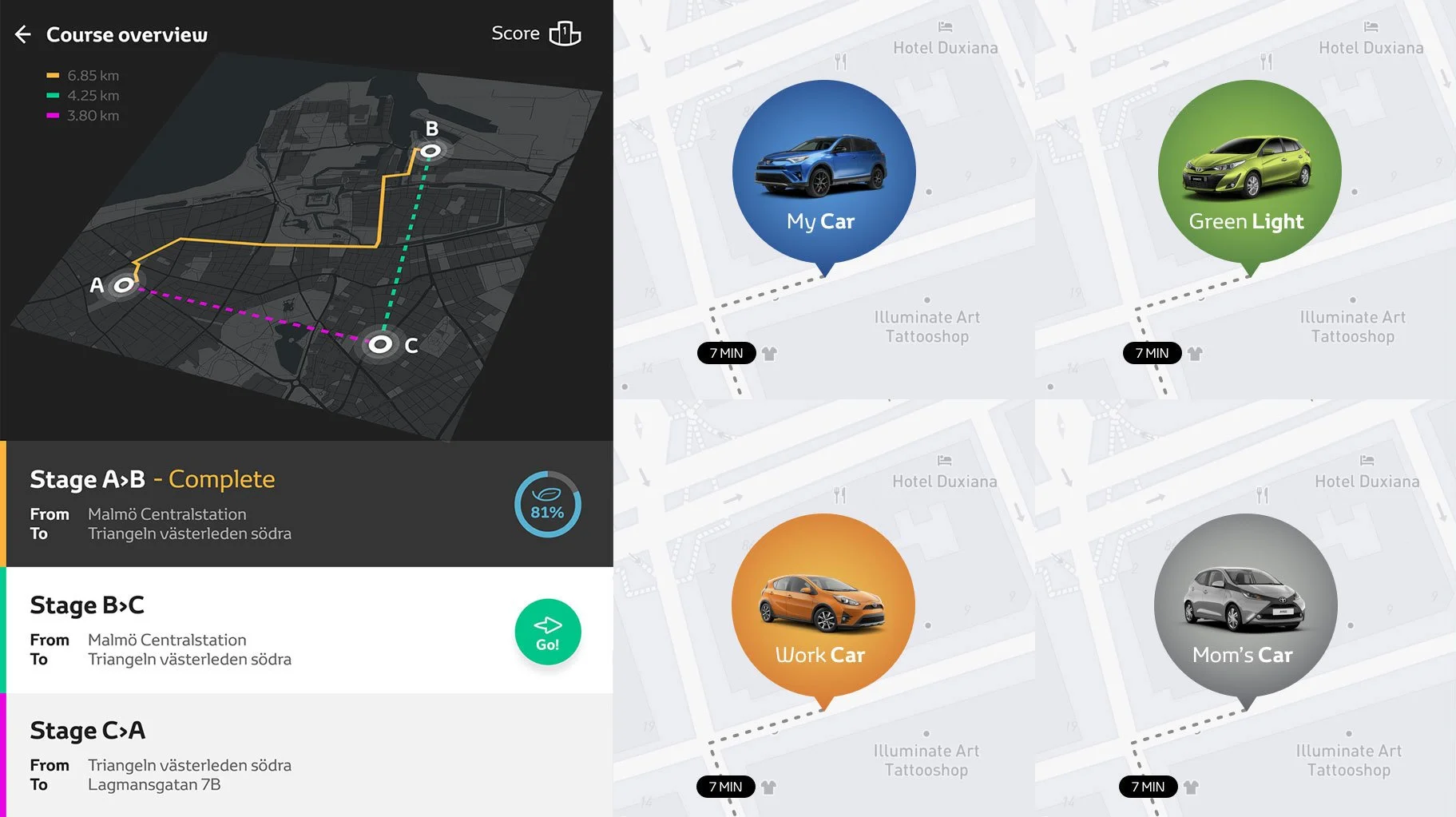
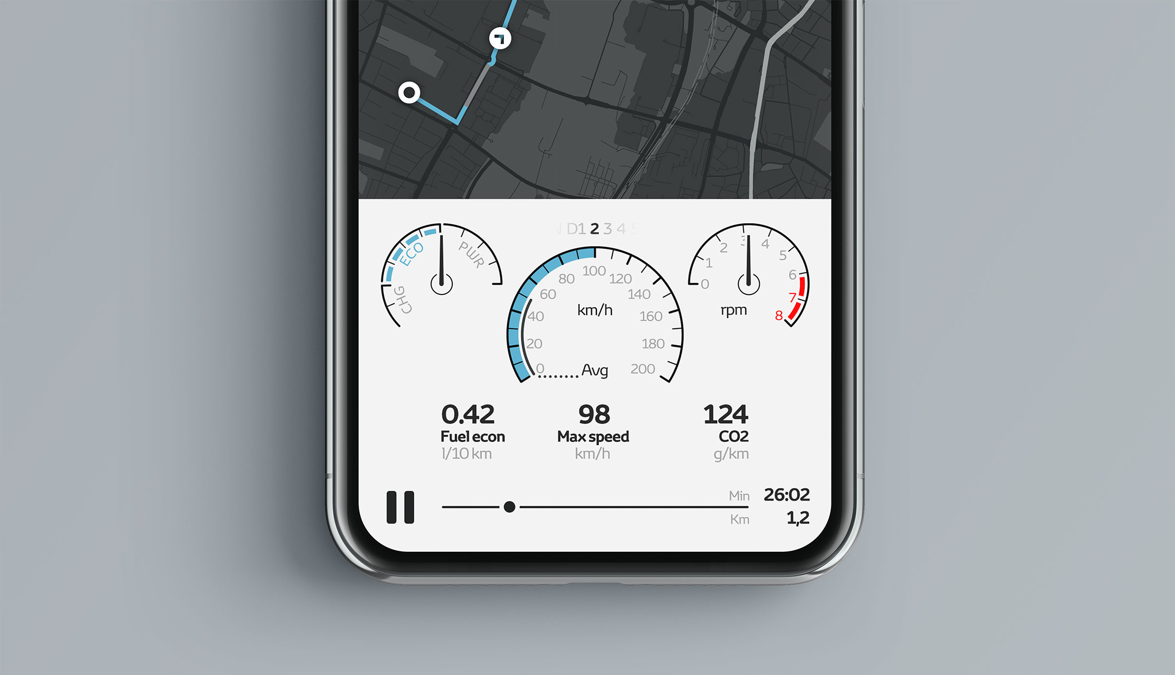
Toyota
Hybrid Drive
I helped Toyota Europe with their new push for a redesigned consumer app including a promo app to educate motor journalist how to drive the best way with Toyota’s hybrid cars. The new approach put driving in focus, with an aim to make it the app that helps the driver and more personal. To highlight the strengths of hybrid technology, visualisations of individual driving behaviour using real-time data and its impact on fuel economy and driving experience was key.
app design
design with data
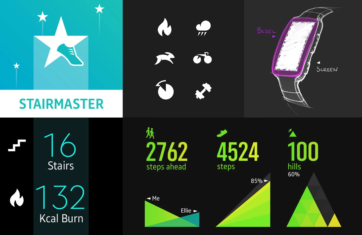
Samsung
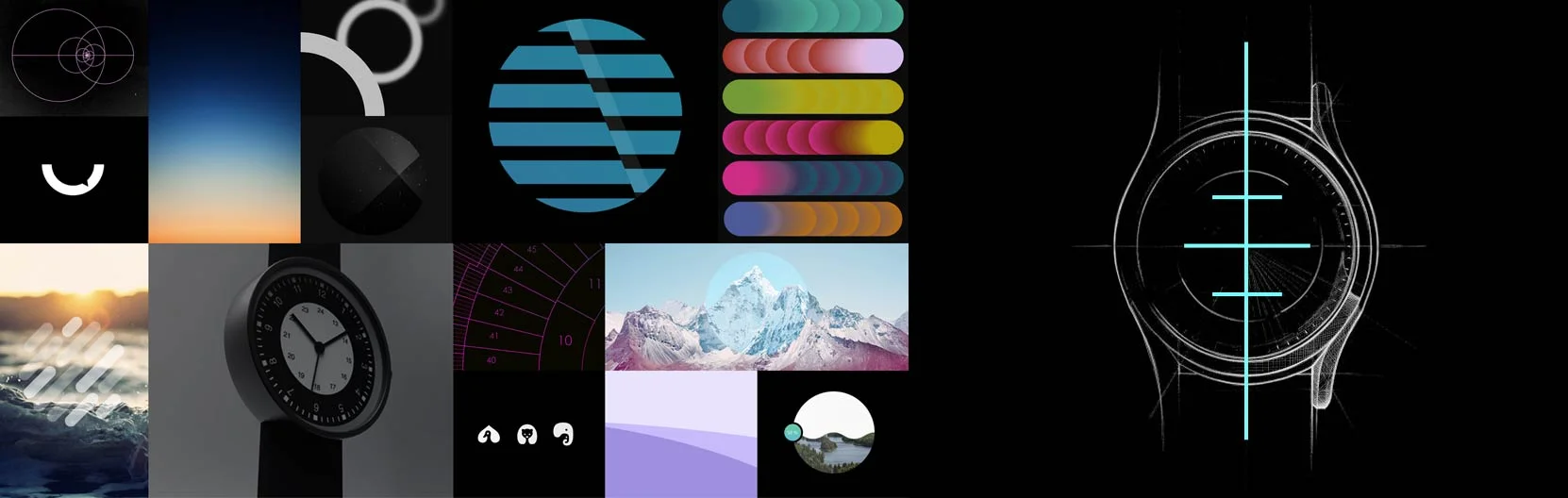
illustration manner
The illustration style created for Samsung mixes geometrical shapes with straight lines to create a sense of motion and direction, in line with what their service S-health is all about. Further on the style was also adapted to Bixby and became the overall style for illustrative imagery on their Android devices.
app design
visual style
Video reel
2025
I've gathered some clips from various projects throughout the years. Most of my video work is done in After Effects, Cinema 4d and Premiere, and when it comes to motion style I'm quite fond of the simplistic, smooth and expressive qualities. Have a look and let me know if you'd like to see more.
3d modelling & animation
green screen
motion branding